 News
News The image of the International Museum of Watchmaking (MIH) had not been renewed for nearly twenty years.
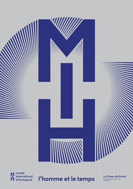
A first institutional poster had been launched in 1974 when the building was inaugurated and a second – still in use – in 1999 to mark its 25th anniversary and the publication of its reference catalogue. In late September, the MIH revealed its third identity change on a large scale, taking in its logo, institutional poster, promotional flyer and museum plan. Over and above the indispensable modernisation of its image and communication, the MIH is now paying closer attention to its international audience by providing tools which help them on their visit.
The simple, new and highly readable logo gives pride of place to the acronym MIH through a graphic treatment which evokes the intricate components of a watch, a system of gear wheels or the chain links that are encountered in antique horological movements.
Understated, subtle and resolutely graphic, the new poster promotes the institution. It retains familiar previous references such as the use of blue since 1999 (although a deeper shade of blue has been chosen this time) and the subtitle of the museum Man and Time adopted back in 1974. The poster reflects the global image of the MIH. Through its clear and understated lines it makes reference – without lapsing into watchmaking stereotypes – to the movement of a watch through the intricate links between the letters which form the acronym of the museum (MIH) and also the precision of a chronometer with indexes radiating out from its centre. Telling the time, and more philosophically the reference to passing time, appear as the underlying theme of the poster through the interplay of a multitude of hands. Apart from blue, a symbol of the earth and sky, the use of silver as the background colour evokes metal that is present everywhere in the objects of the collection: it reflects the prestigious character of this collection and permits optical effects which cannot fail to attract the visitor’s eye.
With a fuller content than its predecessor, the new flyer takes up the basic concept of the poster once again. It gives a concise presentation of the MIH in five languages (French, German, English, Italian and Spanish) enabling 90% of all the visitors to be reached. The audio-guide is available in these same languages.
The plan guide is a practical document distributed at the entrance to the museum and written in seven languages (French, German, English, Italian, Chinese and Japanese) which are used by 95% of the MIH visitors. It reflects the new thematic and chronological organisation of the permanent exhibition. This document seeks to guide the visitor more effectively through a museum which has the specific - and sometimes disorienting - character of allowing visitors to find their own way through the exhibition. With the plan and description of the different spaces, visitors will be able to make their way around more easily and select themes to be discovered which reflect their own particular interests. It will also be useful for hurried visitors who do not have time to see the whole collection, enabling them to target their visit.
These new facilities will be deployed gradually from October onwards. They round off the free multilingual audio-guide (French, German, English, Italian, Spanish) which was presented in the spring of 2016 on the izi.Travel platform.
October 20, 2016